Pushing the limits of Markdown

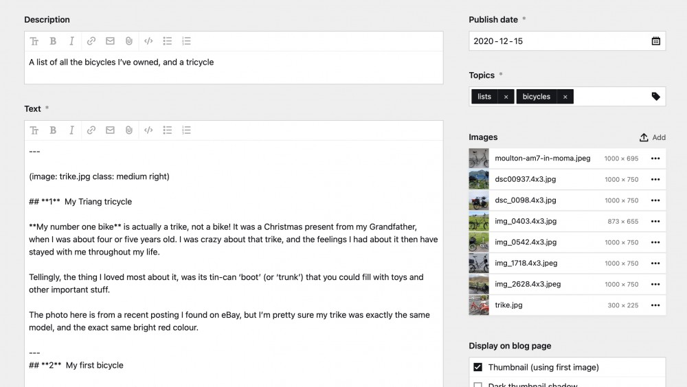
I’m a big fan of writing content directly into Kirby’s Markdown entry field
With everything in plain text, and image thumbnails helpfully displayed alongside — for me Kirby’s Markdown editor still offers the best, and lowest-friction workflow — for both spontaneous blog posts, and long-form articles alike.
The downsides of this Markdown field, lie in its limited layout options. So I’ve spent a lot of time experimenting with CSS for the classes set in Kirby’s image KirbyTag, and I’ve come up with a few ideas to extend the capability of this simple text field.
My recently updated example blog post demonstrates the wide range of page layout and text styling that can be achieved, using just plain Markdown text and one standard KirbyTag
But, keeping the Markdown simple meant the CSS became super-complex. The two areas I struggled with most were:
-
Horizontal layout and sizing of images. Although I got this to work with percentage widths, these needed too many horrible positioning hacks in the ‘image rows’. Also, printing of pages with percentage widths is still full of layout bugs in all the browsers I tested. So, I resorted to old-fashioned pixel widths, negative margins, and floats, for everything — plus my ‘hidden hr trick’ for rows.
-
Precise vertical spacing of text, headings, horizontal rules, and images. My CSS relies on using
margin-topfor ALL vertical spacing. This is the ONLY way to control vertical spacing between specific combinations of headings, images, and text — using super-powerful adjacent-sibling* + *selectors.
The key Markdown and CSS coding patterns I used
See what can be achieved
I’m very enthusiastic about using Markdown for the sort of writing I do, and the varied layouts I want. So I encourage you to take a look around my site, and at the example blog post I’ve also linked above.
Of course, these Markdown and CSS ‘tricks’ are not as capable as Kirby’s brilliant new Blocks and Layout fields. Nevertheless, for many kinds of website, they’re still the fastest and easiest way of creating more powerful layouts, but without adding distraction and complexity to the editing experience.
Let me know what you think!