How I made my blog posts more responsive (and why I think it matters)
Responsive web design is an almost universal feature of modern websites, in which page layouts are changed automatically for different devices and screen sizes.
This is not just to make them look better, but (hopefully) also to make them more effective at communicating.
However, if you look more closely, in practice many blog designs are still not fully responsive…
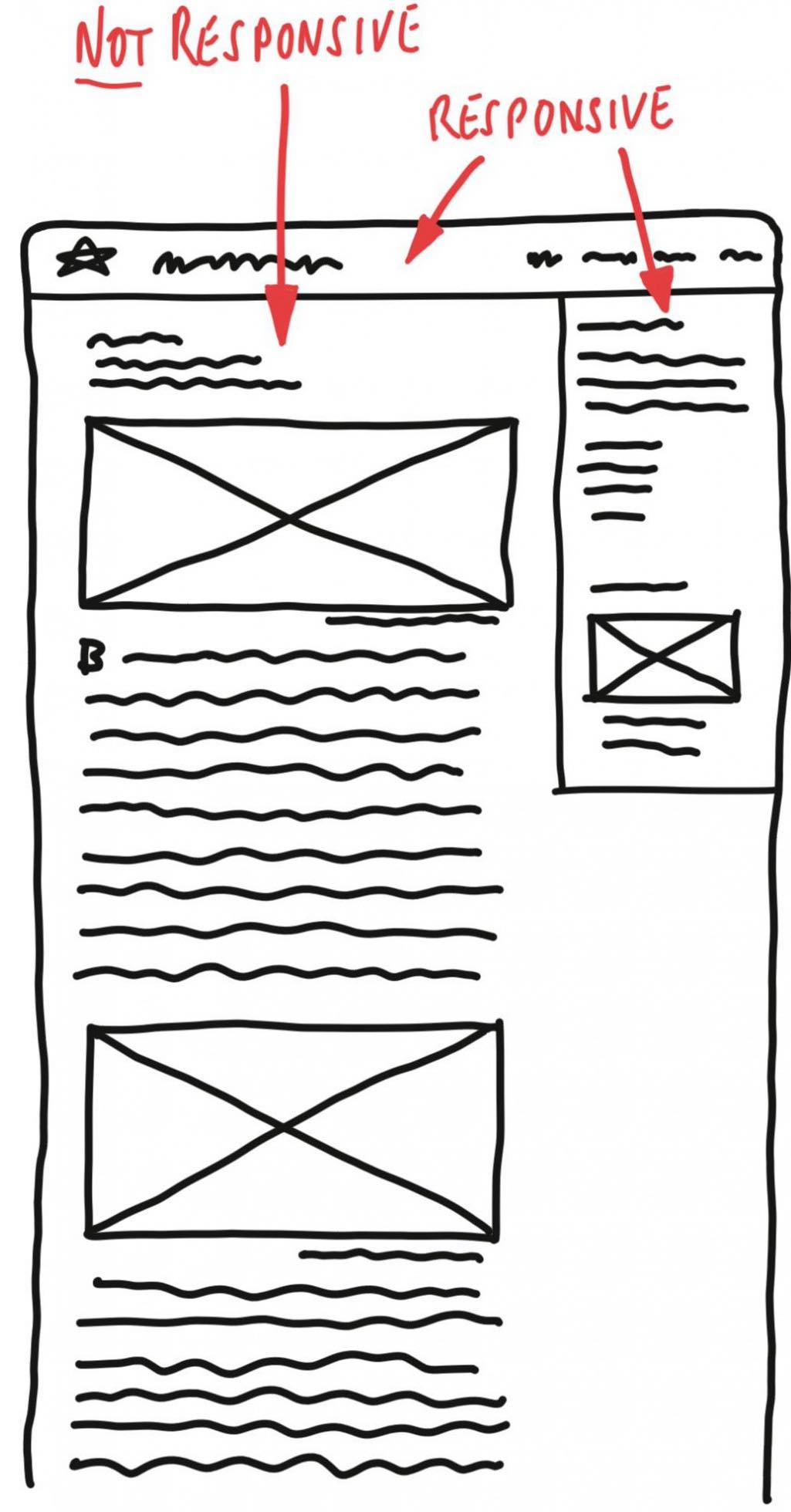
Because, whilst their landing and marketing pages might all have beautiful responsive designs, their single post pages are often left with a fixed layout for the post’s main content — a single column filled with a vertical stream of text and (oversized) full-column-width images.
This means that, even when using a wider screen, users have to scroll in order to view the post’s text and images — sequentially, rather than alongside each other.
For some topics this might not matter, especially when they are carefully written and captioned. Nevertheless, I think that whenever text and images can be seen together without scrolling, they enhance and reinforce each other. The content becomes more visually attractive, and communicates more effectively.
Of course there are a growing number of website builder themes and plugins that enable non-coders to compile more complex layouts like these.
However, most of them seem to be aimed exclusively at landing and marketing pages. And, based on my own experience with using Craft's Matrix field, I suspect that they are still too intrusive and clumsy for day-to-day use with personal blog posts.
That’s why I’ve spent so much time designing and coding the responsive layout on this blog…
My new website design can have responsive content on any page
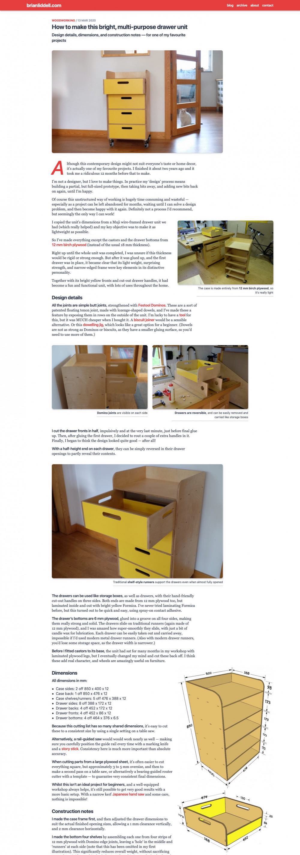
The image alongside here is a screenshot of the desktop view for one of the first posts on my website.
This detailed woodworking post is a good illustration of what I’ve been able to build, without any plugins, entirely from within a single text-only field in Kirby CMS.
Every image on this page has its file name, its size, its position, and its caption, all defined using a bracketed ‘shortcode’ called a KirbyTag, inserted inline with all the other text in Kirby’s Markdown editor.
Each image can be instantly resized with a tiny text amendment, or moved with a simple cut-and-paste — to appear at its optimum size, alongside or above any other paragraph.
On my woodworking post, this means that the cutting list can be viewed alongside the dimensioned drawing, and features throughout the text can be illustrated by an adjacent photo.
Even for a simple blog post, I think this is worthwhile. Of course, I realise that reading blog posts on a small screen can never be as effective or engaging as a well-designed book or magazine — where headlines, sub-heads, captions, and images can all be ‘eyeballed’ together — and many different parts of a story can be compared and contrasted.
Nevertheless, I’m pleased with what I’ve been able to achieve, in a simple and flexible way, using just one image shortcode in Kirby’s Markdown entry field.
There are more examples in my first blog post, and hopefully, throughout the rest of my website.